Master-Inspired Color Palettes: A Designer's Guide to Using Art History for Color Selection
Overview
Color is one of the most challenging elements in design. Traditional palette generators often fall back on the same muted pastels, ignoring centuries of color expertise captured in master painter artworks. PaletteInspiration.com solves this by providing a browsable archive of color palettes extracted from over 3,000 artworks by legendary painters like Monet, Vermeer, Raphael, and Van Gogh. This tutorial walks you through how to leverage this tool to find unique, historically informed color combinations for your digital design projects. You'll also learn how to use the Color Harmony Explorer – an interactive wheel that reveals which hues master painters empirically paired with a given color, based on actual co-occurrence in real paintings rather than algorithmic color theory rules. By the end, you'll have a practical method for breaking out of the typical palette rut and infusing your work with the richness of art history.
No signup, no paywall, no email capture required – the tool is completely free and open for exploration.
Prerequisites
- A modern web browser (Chrome, Firefox, Safari, or Edge) with JavaScript enabled.
- A basic understanding of color terminology (hue, saturation, lightness, complementary, analogous, triadic).
- Optional: Access to a design tool (Figma, Adobe XD, Sketch, or even CSS) to apply the discovered palettes.
- An open mind to move beyond algorithmic color rules and embrace empirical pairings from art history.
Step-by-Step Instructions
1. Access PaletteInspiration.com
Navigate to PaletteInspiration.com. The landing page presents a grid of thumbnail artworks from the collection of 3,000+ master painters. Each thumbnail hints at the dominant colors in that piece. Scroll through or use the search/filter options to find a specific painter or era.
2. Browse Individual Artwork Palettes
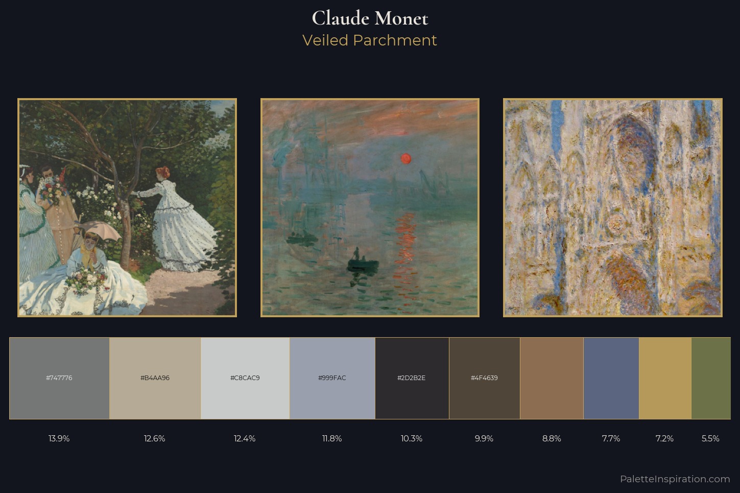
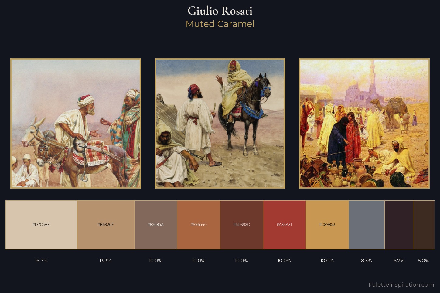
Click on any thumbnail to open the detailed view. Here you'll see the original artwork alongside a curated set of 3 to 6 color swatches extracted from it. Each swatch displays its hex code (e.g., #B7410E) for easy copy-pasting into your design tools. Beneath the palette, there's often a short note about the artist and the historical context of the color choices (e.g., "Vermeer's use of ultramarine derived from lapis lazuli, a precious pigment").
Tip: Hover over a swatch to see its approximate name and percentage of the painting it covers. This helps you understand which colors dominate the composition.
3. Use the Color Harmony Explorer
On the navigation bar, locate the Color Harmony Explorer link. This interactive tool is the core feature. It works like a color wheel – drag the central handle or click anywhere on the wheel to select a hue.
As you select a color, the surrounding ring automatically populates with other hues that master painters have historically paired with it. These aren't limited to standard complementary (opposite on the wheel), analogous (adjacent), or triadic (evenly spaced) relationships. Instead, they are empirical pairings mined from actual co-occurrence across thousands of paintings. For example, selecting a deep crimson might show pairings with muted earth tones and golden yellows – a combination found frequently in Rembrandt's works, even though standard color theory would suggest green as the complement.
You can click on any suggested hue to dig deeper – it will become the new center, and the explorer will show you its historical pairings. This iterative browsing mimics the way artists experimented with color over centuries.
4. Save and Export Your Favorite Palettes
Once you find a palette that resonates, you can save it to a personal collection (requires no account – it's stored in your browser's local storage). Look for the Save Palette
button or the heart icon. You can also export the palette as a CSS variable string, a JSON array, or a simple copyable list of hex codes. For frontend developers, the CSS export is particularly handy: --color-primary: #D4AF37; --color-secondary: #1F3A5F;
5. Apply to Your Design Project
Now take the hex codes or CSS variables and apply them to your design. For example, in a web project:
.hero { background-color: var(--color-primary); color: var(--color-secondary); }But don't stop at colors – consider the mood and balance. A palette from a Van Gogh painting might suit an energetic brand, while a Vermeer palette works well for calm, premium aesthetics. The tool also provides a small caption with the original artwork and artist – use that as a conversation starter or a design rationale in your project documentation.
Common Mistakes
Mistake #1: Over-relying on the Color Harmony Explorer as a Strict Rulebook
Remember that the explorer shows observed pairings, not prescriptions. These are based on statistical co-occurrence – a color that appears often with another in master paintings. But design context matters. Don't force a pairing into your project if it clashes with your brand identity or intended emotion. Use the explorer as a source of inspiration, not a rigid template.
Mistake #2: Ignoring Saturation and Brightness Adjustments
The swatches provided are extracted with their original lightness and saturation. Sometimes those values may be too muted or too intense for digital screens. It's perfectly fine to adjust the lightness and saturation while preserving the hue relationship. For instance, if a master palette uses a very dark shadow color, you can lighten it for better readability on a website background.
Mistake #3: Dismissing Less Famous Painters
The collection includes 3,000+ artists – don't just stick to the household names like Van Gogh or Monet. Lesser-known painters from the Renaissance or Baroque periods often have surprisingly modern color combinations. The search bar lets you filter by art movement (Impressionism, Baroque, etc.), so explore outside your comfort zone.
Mistake #4: Forgetting to Test Accessibility
Master painters created for canvas and ambient light, not for screen contrast. Some color pairs that look beautiful in a painting may fail WCAG contrast guidelines for text. Always test foreground/background contrast when applying the palette to UI elements. Use tools like the WebAIM Contrast Checker alongside the palette.
Summary
PaletteInspiration.com and its Color Harmony Explorer offer a unique, empirical approach to color selection by mining the collective genius of 3,000+ master painters. This tutorial showed you how to browse artwork palettes, interact with the harmony explorer to discover historically grounded color pairings, and export those palettes for practical design use. By avoiding the trap of generic generator palettes and embracing real artistic data, you can create designs that feel richer, more intentional, and rooted in centuries of visual culture. No account or payment required – start exploring today.
Related Articles
- Intuit Lays Off 17% of Workforce to Accelerate AI Transformation
- How to Protect Your Location Data: Lessons from the FTC vs. Kochava Settlement
- 5 Reasons the 2024 Kindle Scribe Beats the Wait for a Color Model
- Navigating the End of an Era: A Guide to Stephen Colbert’s Final ‘Late Show’ Episodes
- How to Observe Your Retinal Blood Vessel Shadow (Purkinje Tree)
- IoT Crisis Looms as AI Tools Generate Massive Technical Debt, Experts Warn
- Bumble Abandons Swipe Feature, Bets on AI Dating Assistant ‘Bee’
- MCP Servers: The Breakthrough Technology You Need to Know About – Expert Explains Why It Matters